Virgin Media
Homepage UX Redesign
Role:
Lead UX Designer
Year:
2022
Methods:
UX Strategy · Analytics · Concept Design · Prototyping · Moderated User Testing
Summary
Virgin Media's homepage had over 200,000 daily visits but a conversion rate of just 0.22%, with low engagement on key modules and heavy reliance on navigation to find offers. I led the UX strategy and concept design to explore two alternative homepage experiences, balancing immersive brand storytelling with clearer product discovery, validated through moderated user testing with 12 participants.
Two homepage concepts validated
Research confirmed stronger first impressions, clearer entry points, and improved brand perception compared to the existing homepage experience.
Key impact
Homepage concepts
Moderated user research sessions
Daily homepage visits analysed
PROJECT OVERVIEW
The Virgin Media homepage is one of the website's highest-traffic entry points, receiving over 200,000 daily visits, yet its conversion rate remained at just 0.22%. Despite strong brand presence, key modules showed low engagement and users relied primarily on navigation to find relevant offers.
I led the UX strategy and concept design to explore two new homepage experiences, an immersive full-screen carouseland a dynamic modular grid, each designed to balance brand storytelling with clear product discovery. Both concepts were validated through moderated user testing with 12 participants, providing actionable insights to inform future iterations.
Context
BUSINESS OBJECTIVES
Increase clarity, engagement, and progression toward key product journeys from Virgin Media's highest-traffic entry point
Explore alternative homepage models that balance brand storytelling with product discovery across broadband, mobile, and bundle offers
Identify interaction patterns and visual hierarchies that better support both exploratory and goal-oriented users
Provide a validated design foundation for future homepage iterations and implementation
UX CHALLENGE
Despite high traffic, the existing homepage had a 0.22% conversion rate and a 41% bounce rate, with low engagement on key modules including the carousel and serviceability widget
Users relied heavily on global navigation to find relevant offers, suggesting the homepage itself was not effectively guiding them
The redesign had to serve a diverse user base, from brand-aware returning customers to new visitors discovering Virgin Media for the first time
Any new concept had to maintain Virgin Media's bold visual identity while improving clarity, navigation confidence, and progression to product journeys
MY ROLE
I led the end-to-end UX strategy, concept design, interaction design, and prototyping for the homepage redesign exploration, collaborating closely with the research team, stakeholders, and engineering.
Defining the UX strategy and design direction for the homepage concept exploration
Analysing behavioural analytics to identify engagement gaps and design priorities
Designing and prototyping two distinct homepage concepts with interaction models and animations
Collaborating with the UX research team to design and run moderated user testing sessions
Synthesising findings into clear design recommendations for future iterations
USER PERSONAS
To ensure both concepts addressed the full range of Virgin Media's digital audience, the design was informed by 5 digital tribes defined through a workshop with an external research agency.

Savvy Customisers

Digital
Newbies

Device Enthusiasts

Mobile Minimalists

Human
Seekers
Define
PROBLEM STATEMENT
The existing homepage, despite receiving over 200,000 daily visits, had a 0.22% conversion rate and 41% bounce rate, with users disengaging from key modules and relying on navigation to find offers
Low interaction with the carousel and serviceability widget indicated that the current homepage structure was not supporting user intent, whether exploratory or goal-oriented
The challenge was to reimagine the homepage experience in a way that maintained Virgin Media's brand identity while delivering clearer product visibility and stronger entry points to conversion journeys
HYPOTHESES
If the homepage clearly highlights key offers and product journeys while reinforcing the brand, users will better understand Virgin Media's value proposition and feel more confident navigating the site
If immersive visual storytelling is combined with clear product entry points, users will engage more with promotional modules without losing sight of their primary intent
Early validation through moderated testing will allow design decisions to be refined before wider implementation, reducing risk and increasing confidence in the chosen direction
DESIGN-LED CHALLENGE
From a UX perspective, the challenge was to design a homepage experience that:
Balances immersive brand storytelling with immediate product clarity, without one undermining the other
Supports both exploratory and goal-oriented users, from new visitors discovering the brand to returning customers looking for a specific deal
Introduces alternative interaction models and visual hierarchies that increase engagement with key modules without overwhelming users
Provides a scalable design foundation compatible with Virgin Media's existing design system and technical constraints
Design
Experience Strategy

1.
User First
A more user-friendly experience where visitors immediately understand what Virgin Media offers and can find what they are looking for without relying on navigation.
2.
WOW Factor
The homepage needed to be more engaging and dynamic than the existing one, surprising and entertaining users through micro-interactions and animations that reflect the brand's bold identity.
3.
Storytelling Concept
The homepage should not function as a list of links. Every section needed to connect to the others and communicate a unified global message, engaging users throughout their journey.
Data-Driven Insights
Before designing, behavioural analytics established a clear baseline of where the homepage was underperforming:
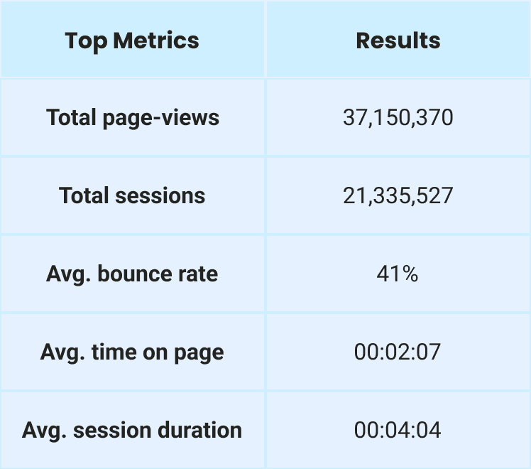
DAILY VISITS
203,007 homepage visits per day, the highest traffic page on the entire Virgin Media site
CONVERSION RATE
0.22% conversion rate with a 41% average bounce rate, despite over 37 million total page-views
SESSION BEHAVIOUR
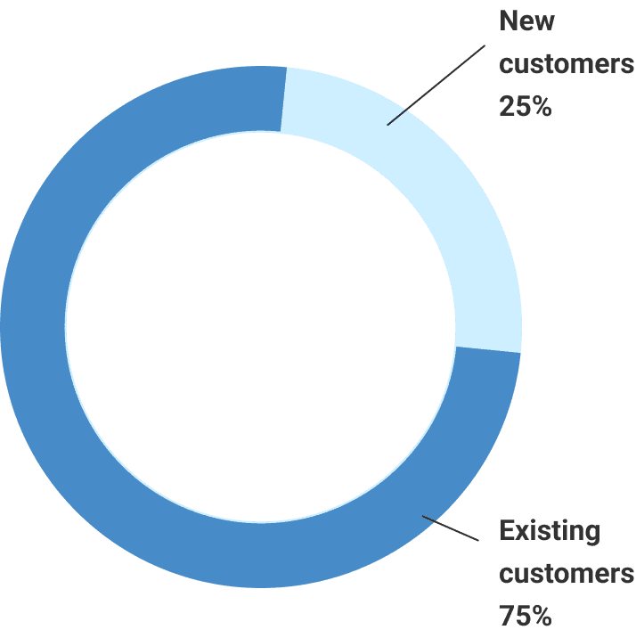
Average session duration of 4:04, with desktop accounting for 60% of sessions but only 0.14% conversion vs 0.36% on mobile

Click Rates
NAVIGATION BAR
Captured 40.99% of all page interactions, confirming users relied on nav rather than homepage modules to find content
HERO CAROUSEL
Generated only 8.03% of interactions, indicating users were actively bypassing the main homepage content module
SERVICEABILITY WIDGET
Low engagement across both desktop and mobile, suggesting users did not find the postcode check prominent or compelling enough to interact with
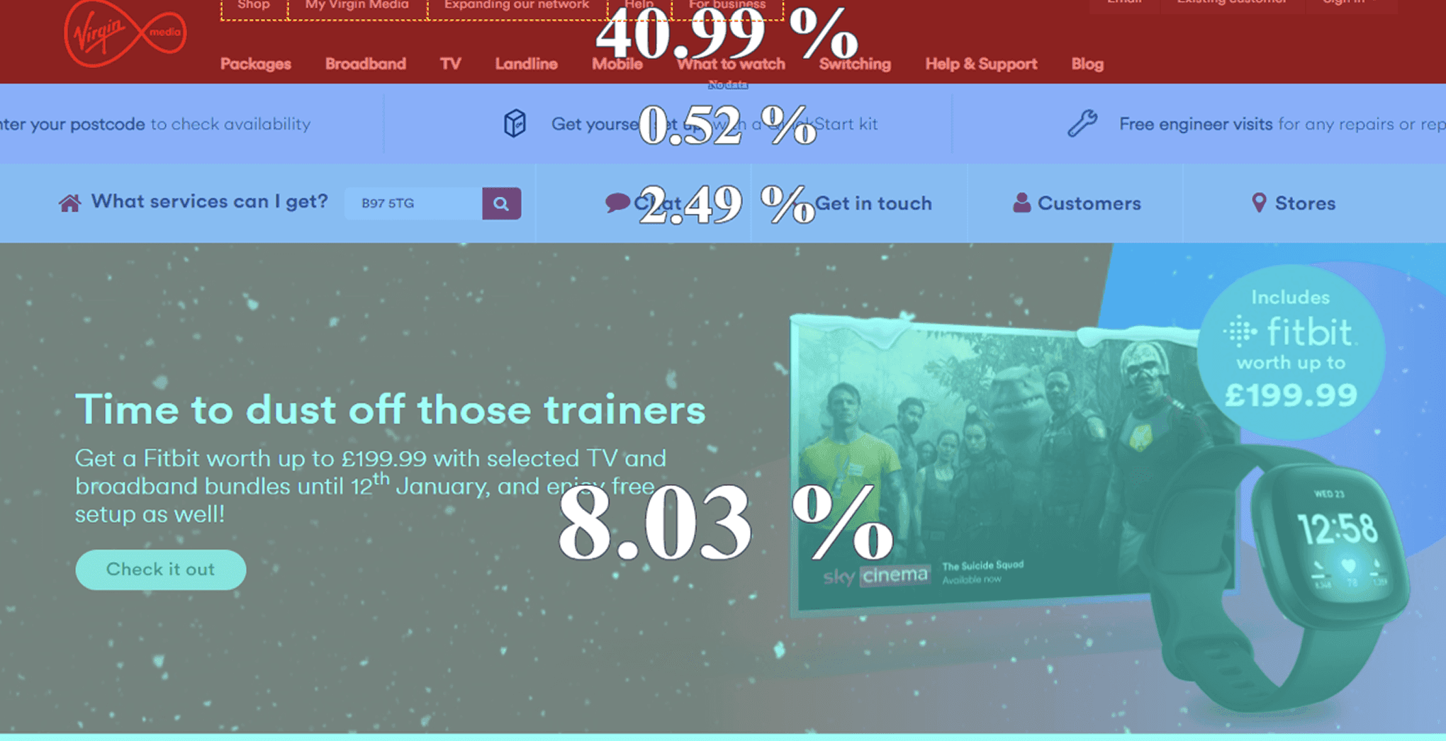
These insights confirmed the homepage was not effectively converting high traffic into product engagement and directly informed design priorities.
Brand and Visual Context
The redesign was grounded in Virgin Media's bold visual identity. Before exploring new concepts, I reviewed the brand guidelines to ensure any new direction maintained recognition and consistency across colour, typography, and visual language

Virgin Media's colour system
VM Red as the dominant brand colour, supported by VM White, VM Plum, and accent colours used to guide attention and separate content areas
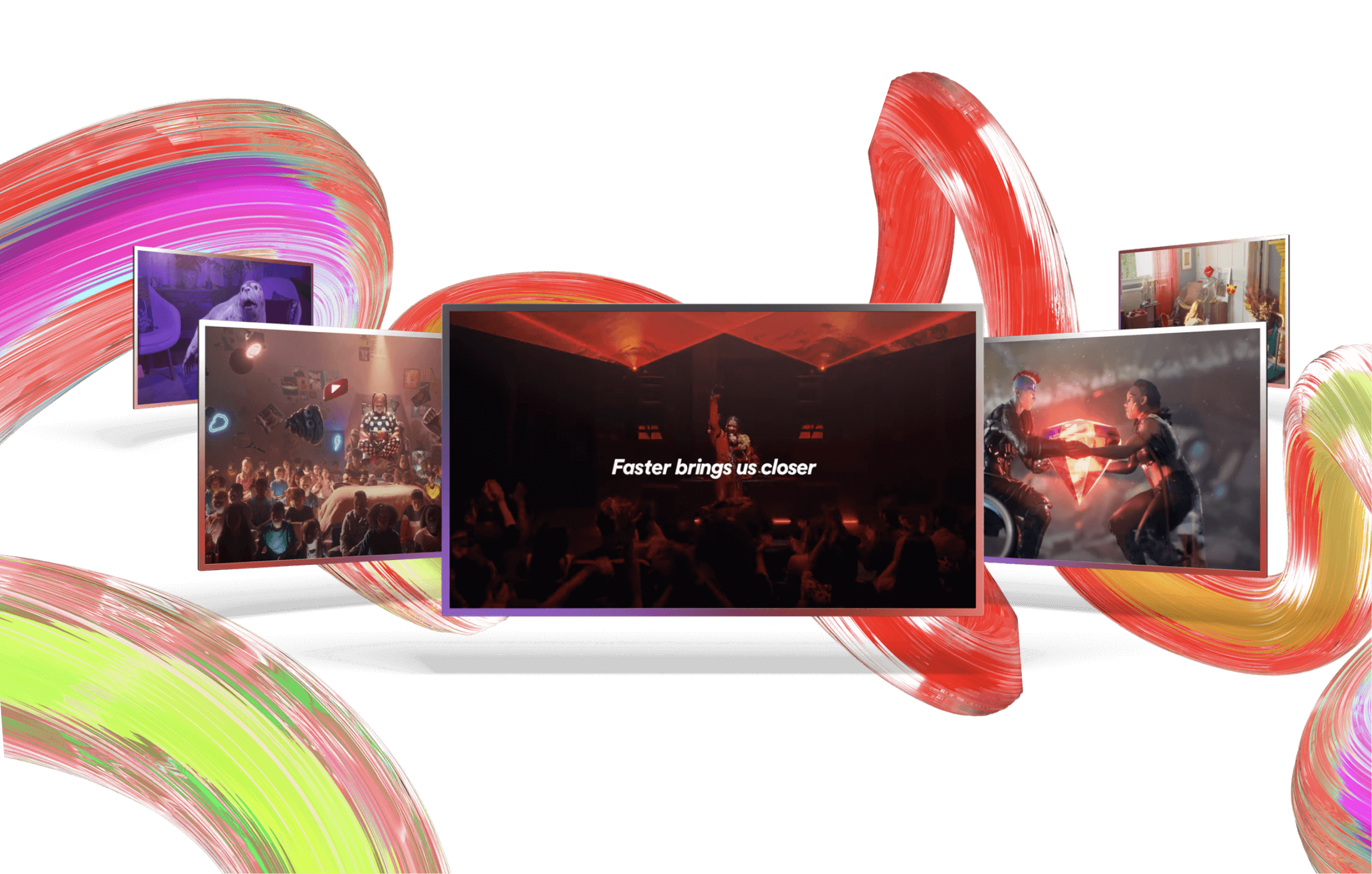
Faster Brings Us Closer
The brand's visual world of motion, immersive imagery, and dynamic energy, which set the creative ambition for both homepage concepts
Virgin Media Design System
Both concepts were built using established component patterns, spacing tokens, and typographic scales from the Virgin Media design system, ensuring consistency and feasibility for engineering handoff
Accessibility
Colour contrast ratios, touch target sizing, and content hierarchy were validated against WCAG 2.1 AA standards, ensuring both concepts were accessible from the start, not as an afterthought
This ensured the design exploration pushed the experience forward while staying firmly within the Virgin Media brand world.
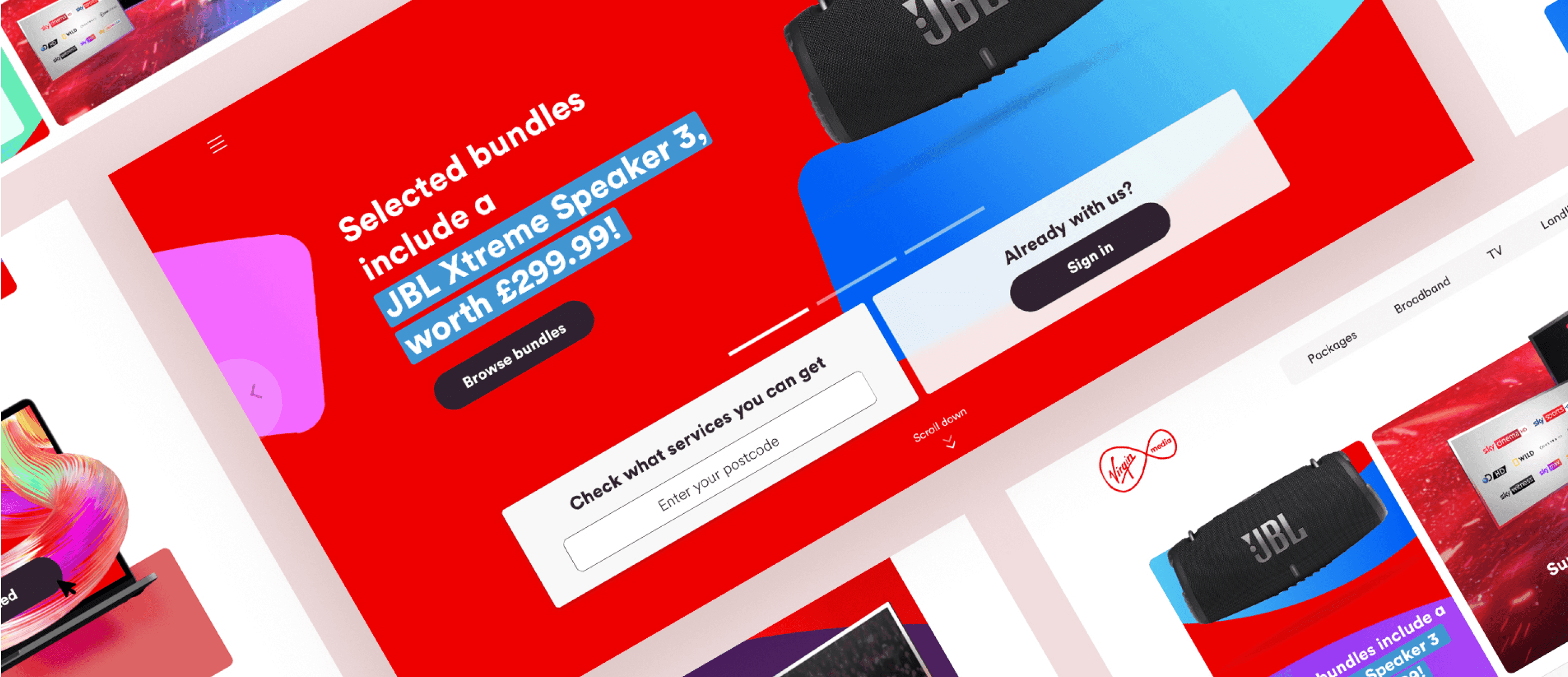
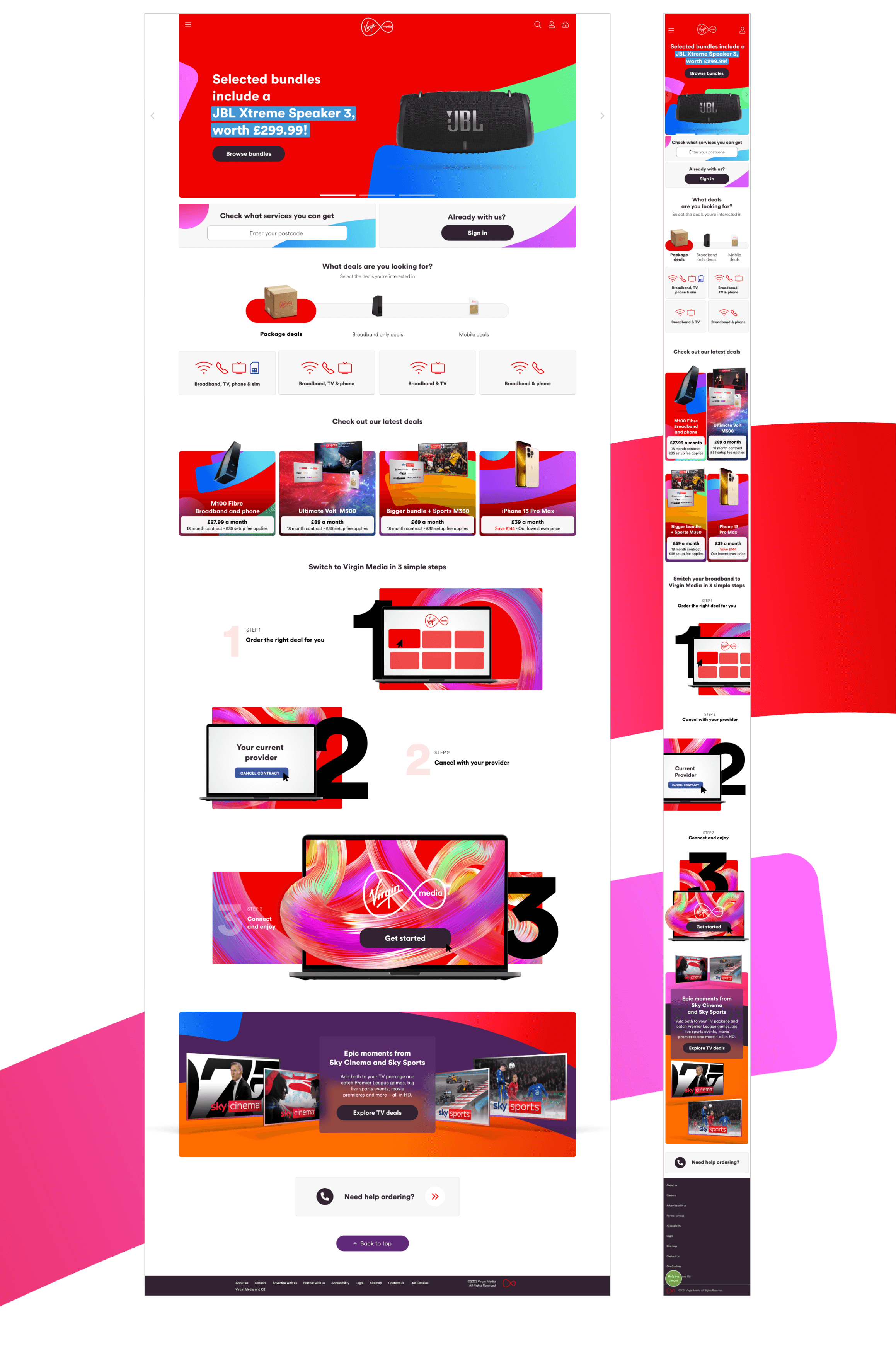
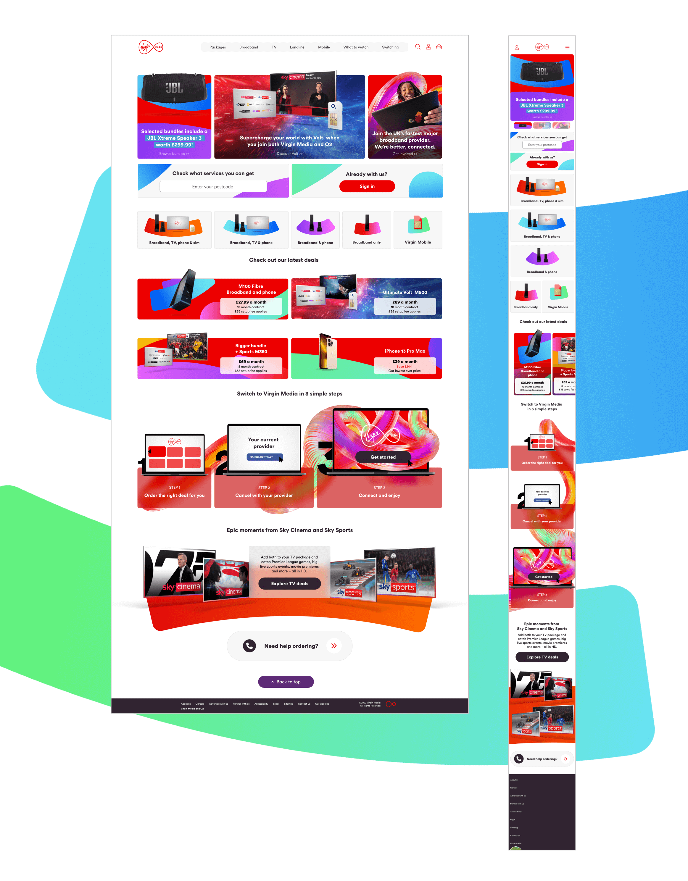
Current Homepage
The existing homepage served as the baseline for all design decisions.
Despite strong traffic, the current experience relied heavily on a standard carousel format with limited visual hierarchy, low module engagement, and no clear prioritisation between brand storytelling and product discovery.
Both new concepts were designed to directly address these structural limitations.

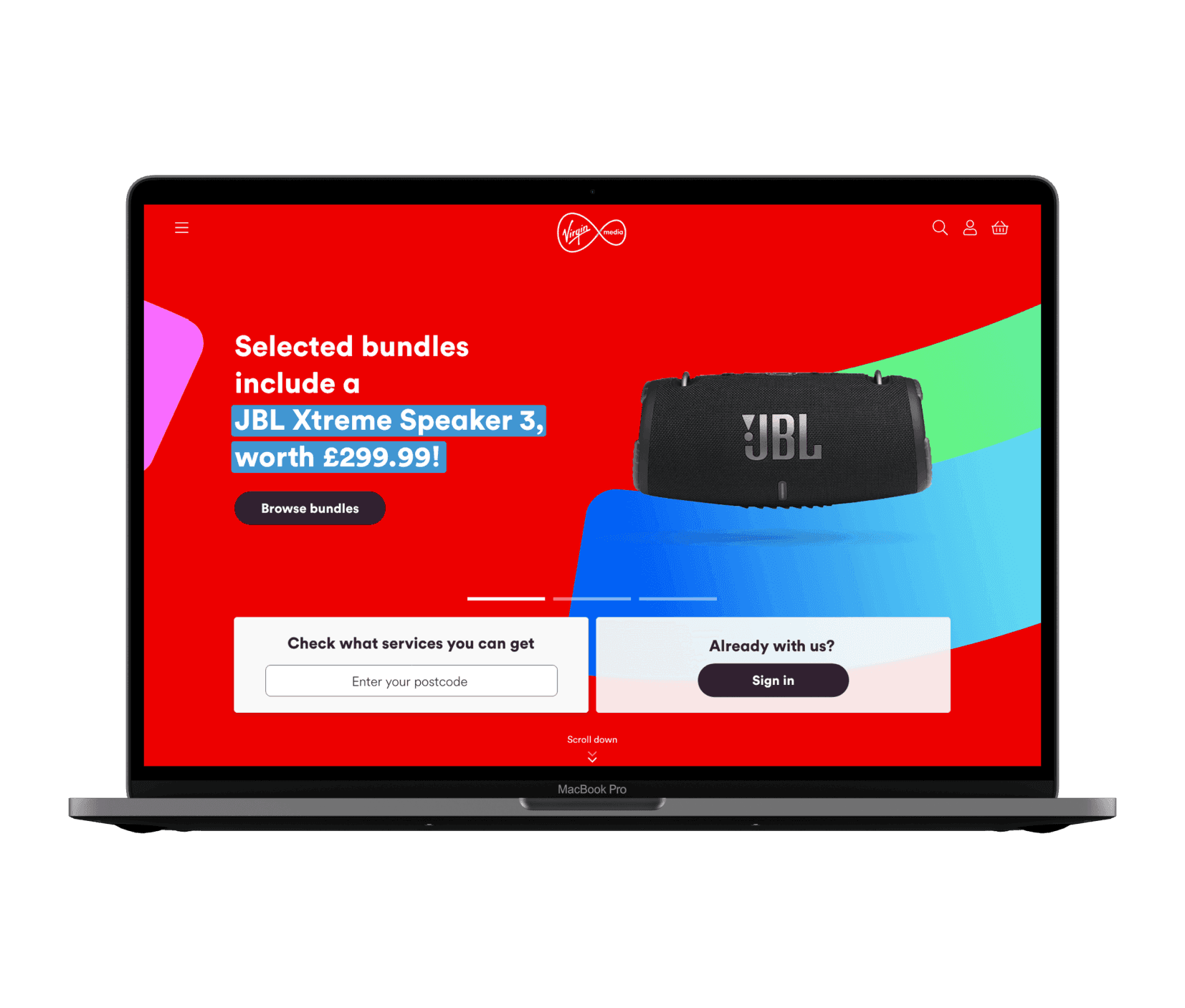
Immersive Brand Carousel
An evolution of the existing homepage carousel, transformed into a full-screen immersive experience where each slide represents a different Virgin Media product or offer. Animated brand elements, micro-interactions, and motion cues bring each scene to life, guiding attention toward key actions while maintaining narrative continuity.
Key characteristics:
Full-screen storytelling
with product-specific slides
Encourage exploration
with micro-interactions and animation
Clear entry points
to products and bundle journeys
MOCKUPS
PROTOTYPES
Dynamic Modular Grid
A structured, modular homepage layout built on a clean white background with Virgin Media's vibrant brand colours guiding user attention across sections. Each grid module highlights a specific product or journey entry point, with subtle animations revealing additional information on interaction.
Key characteristics:
Scannable grid structure
for fast product discovery
Reveal detail without cluttering the layout
with micro-interactions and animation
Clear visual hierarchy
supporting both exploratory and goal-oriented navigation
MOCKUPS
PROTOTYPES
Validate
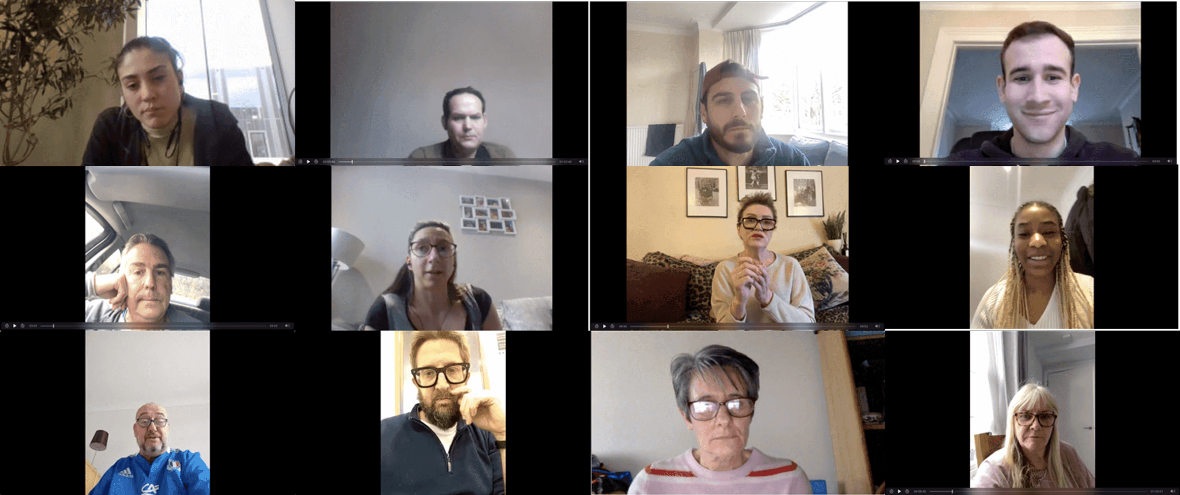
Usability Testing
Participants
12 users representing a mix of digital behaviours and familiarity with Virgin Media services
Method
Remote moderated usability sessions
Materials
Interactive and video prototypes of both homepage concepts
Goal
Evaluate first impressions, navigation clarity, brand perception, and confidence in finding offers and completing key tasks
Stronger first impression across both concepts
FINDING
Participants described both concepts as significantly more engaging than the existing homepage, with clearer visual hierarchy and stronger brand presence.
DECISION
Immersive visuals and structured module layouts both outperformed the current homepage. Either concept provided a stronger foundation for future iteration.
Entry points to products were clearer
FINDING
Users were able to identify key journeys faster in both concepts compared to the existing homepage, with less reliance on global navigation.
DECISION
Module placement and visual prominence of product sections in both concepts validated the strategy of surfacing offers earlier in the page hierarchy.
Brand ans Value perception improved
FINDING
The immersive visuals reinforced Virgin Media's bold identity. Users associated the new concepts with a more premium, confident brand experience.
DECISION
Visual investment in brand expression at the hero level does not compromise product clarity when the hierarchy below it is well structured.
Hypothesis outcome
All three hypotheses were validated through moderated research:
Highlighting key offers alongside brand storytelling improved user understanding and navigation confidence
Immersive visuals combined with clear product entry points increased engagement with key modules
Early moderated testing identified focused opportunities for refinement before wider implementation
Impact
Key Results
Both homepage concepts delivered measurable improvements in user perception and navigation clarity compared to the existing experience. Research validated the core design strategy across first impressions, product discovery, and brand perception:
Stronger First Impression
Users described both concepts as more engaging and visually confident than the existing homepage experience
Faster Product Discovery
Product entry points were identified more quickly, reducing reliance on global navigation to find relevant offers
Improved Brand Perception
Both concepts reinforced Virgin Media's bold visual identity, with users associating the new designs with a more premium experience
Opportunities Identified
Testing surfaced clear areas for further refinement, particularly around serviceability checks and offer messaging clarity

Hypothesis Proven
Balancing immersive brand storytelling with clearly structured product entry points improved navigation confidence, engagement, and brand perception. Both concepts validated the strategic direction, providing a strong foundation for future homepage implementation and optimisation.
Conclusion

What was delivered
Two fully validated homepage concepts for Virgin Media, each exploring alternative interaction models and visual hierarchies, tested with 12 participants through remote moderated sessions and grounded in behavioural analytics from a page receiving over 200,000 daily visits.
Impact
The research confirmed that both concepts significantly outperformed the existing homepage on first impressions, product clarity, and brand perception.
The work established a validated design direction and a set of clear principles for future homepage iterations, reducing risk for implementation and providing stakeholders with evidence-based recommendations.
What I'd do differently
I would have started with a more thorough information architecture review to ensure brand consistency throughout the full site navigation, not just the homepage.
I'd also have designed task-based testing scenarios focused on conversion, rather than first impressions alone, to better understand how each concept performed under real purchase intent.
Earlier engineering involvement would have grounded both concepts within actual design system constraints, and testing with a broader mix of user segments would have surfaced more nuanced behavioural differences between existing customers and new visitors.