
Vodafone
Network Trial
Role:
Lead UX Designer
Year:
2025
Methods:
End-to-End Ownership · UX Strategy · Usability Testing · Behavioural Analytics
Summary
Vodafone needed an end-to-end digital campaign journey across App and Web for high-traffic events including Glastonbury. I led UX strategy from discovery to delivery across three interconnected user journeys.
58.6% conversion
Outperforming baseline journeys by 2x.
Key impact
Conversion rate
Total orders
Total visits
PROJECT OVERVIEW
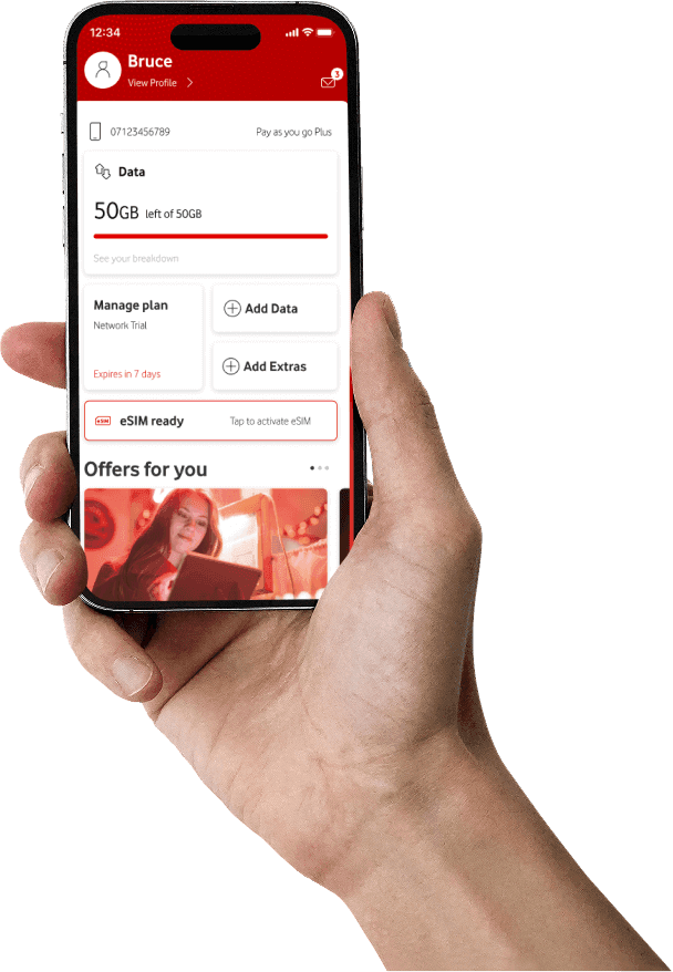
The Network Trial was a strategic Vodafone initiative allowing potential customers to experience the network through a free eSIM-based trial before committing to a paid plan. The project covered the full lifecycle across App and Web, from discovery and registration, through eSIM activation, to trial completion and conversion into a PAYM or Device plan.
ACROSS UK MAJOR EVENTS
The Network Trial was deployed across four major UK events: Glastonbury, Boardmasters, Kendal Calling, and Wimbledon. This case study focuses on Glastonbury in 2025, the most demanding context in terms of scale and user behaviour.


1. Context
BUSINESS OBJECTIVES
Reduce barriers to entry by removing the need for a physical SIM
Drive post-trial conversion into PAYM plans and phone contracts
Generate measurable insights into customer behaviour during trial and conversion
UX CHALLENGE
The previous eSIM activation required users to receive a QR code via email and scan it with a second device, causing significant drop-off at activation
Reduced drop-off in technically complex moments (registration, eSIM activation)
Transition users from a "free trial mindset" to a "purchase decision"
MY ROLE
Defined UX strategy from discovery to delivery
Designed a new in-app eSIM activation (eliminating QR code friction and second device dependency)
Mapped and prototyped key journeys (registration, activation, conversion)
Led usability testing, translating insights into design iterations
Collaborated with product, engineering, analytics, and commercial stakeholders
Presented UX strategy and design decisions to senior stakeholders, adapting designs based on feedback while maintaining user-centred principles
Navigated regulatory and compliance requirements, ensuring the journey met Vodafone's legal obligations while maintaining a seamless user experience

2. Define
PROBLEM STATEMENT
The existing journey introduced significant friction across channels and touch-points
eSIM activation relied on QR codes via email, requiring a second device, creating barriers for single-device users
At high-density events like Glastonbury, any friction directly risked trial completion and brand perception
HYPOTHESES
In-app eSIM activation would reduce setup friction and improve completion rates for single-device users
Removing QR/email dependency would increase clarity, trust, and simplicity
Designing for high-pressure events would create a more resilient everyday experience
DESIGN-LED CHALLENGE
Design a future-state experience, not an iteration of the existing flow
Introduce in-app eSIM activation to eliminate QR/email friction entirely
Ensure seamless performance across web and app at live events and everyday usage
Embed a clear free trial to PAYM or Device contract conversion path from the start
Adopted a design-first approach, validated through targeted research and testing
Ensured accessibility and clarity across all touch-points, critical for users in high-pressure, low-attention environments
The strategic principles guided the journey design:

1.
Self-contained journeys
Users complete the entire trial on a single device (no QR codes, emails, or secondary hardware)
2.
Clarity at critical moments
Complex steps like eSIM activation designed to feel guided and reassuring, not technical
3.
Designed for real contexts
Journeys built to perform with limited attention, variable connectivity, and time pressure
4.
Design system adherence
All UI components built within the Vodafone design system, ensuring visual consistency across App and Web and scalability for future iterations
5.
Accessible by design
Colour contrast, touch target sizing, and plain language instructions designed to meet WCAG AA standards and optimised for high-distraction outdoor environments
3. Design
Registration Journey
Clear value communication
What the trial offers, upfront and unambiguous
Minimal cognitive load
Simplified steps to reduce friction at entry
Early trust signals
Reassurance at every critical moment
USER JOURNEY

MOCKUPS
Lead with value

Progressive disclosure

Closing the loop

PROTOTYPE
Registration in action
The prototype demonstrates the full registration journey (from trial discovery to order confirmation).
Designed to minimise friction and build confidence at every step, validated through usability testing at Glastonbury.
eSIM Activation Journey
Designed as a new in-app capability, replacing the previous QR code flow that required a second device. The goal was to make a technically complex process feel simple, guided, and completable on a single device.
Eliminate QR/email dependency
Full activation within the Vodafone app
Step-by-step guidance
Plain instructions reducing anxiety at each step
Single device completion
No secondary hardware, no email required
USER JOURNEY

MOCKUPS
Clear entry point

Native app prompt

Device confirmation
Native device confirmation that eSIM is successfully installed, before connecting.

Value delivered
User connected and ready to use the trial. The entire activation completed on a single device.

PROTOTYPE
Full eSIM activation in action
End-to-end prototype showing the complete BAU onboarding and in-app eSIM activation: from trial discovery to network connection, fully self-contained on a single device.
From QR code to in-app activation
Before
The original eSIM activation required users to scan a QR code sent via email, often needing a second device. For single-device users at live events like Glastonbury, this was a critical friction point causing drop-off at the most important step in the journey.
After
The new in-app activation replaced the QR code entirely. Users tap "eSIM ready" directly within the Vodafone app, no email, no second device, no technical knowledge required. The entire activation is self-contained and completable in under two minutes.
This was the single most impactful design decision in the project, removing a barrier that made the trial inaccessible for a significant portion of users.
BEFORE

AFTER

Post-Trial Experience
Designed as a new in-app capability, allowing trial users to convert to a PAYM SIM or device without leaving the app. A business requirement from the start, validated through usability testing which revealed that the original BAU design without a clear CTA caused significant confusion at the critical conversion moment.
In-app conversion
Full purchase journey within the Vodafone app; no redirects, no drop-off
Clear choice architecture
SIM or device presented as distinct options, reducing cognitive load at decision point
Value-led USP trays
Key benefits surfaced before commitment, supporting confident conversion
USER JOURNEY

MOCKUPS
Visible entry point
High-visibility CTA added post-usability testing, original BAU caused drop-off at the most critical conversion point.

In-app product selection
SIM or device presented as a clear choice without leaving the app.

SIM USP tray
Key benefits surfaced before commitment, reducing purchase anxiety.

Device USP tray
Consistent interaction pattern across both conversion paths.

Phone purchase journey
SIM plan purchase journey
PROTOTYPE
Conversion journeys in action
Both conversion paths (PAYM SIM and device purchase) fully self-contained within the Vodafone app. From trial ended screen to order confirmation, no redirects required.
4. Validation
Moderated usability testing across three journey scenarios (registration, eSIM activation, and post-trial conversion). Three critical friction points identified, each directly informing a design iteration.
Registration Journey
FINDING
Users were uncertain whether the trial SIM would conflict with their existing SIM, creating hesitation before completing registration.
DECISION
FAQ section updated to explicitly address dual-SIM functionality, removing uncertainty at a critical trust moment.
eSIM Activation
FINDING
Users slowed down at the login step, the CTA was not prominent enough, causing hesitation at a technically unfamiliar moment.
DECISION
Login CTA redesigned to be more prominent and action-oriented, reducing friction at the most complex step in the journey
Post-Trial Conversion
FINDING
Users reaching the end of trial could not identify how to convert; the original BAU design lacked a clear CTA, causing drop-off at the most critical conversion moment.
DECISION
High-visibility CTA added above the fold, unambiguous, action-oriented, impossible to miss.
BEFORE

AFTER

Before
Original design, login link buried in plain text, easy to miss. Users slowed down at this step, unsure how to proceed during a technically unfamiliar process.
After
Post-testing redesign, login presented as a prominent button, immediately visible and action-oriented. Reduced hesitation at the most technically complex moment in the eSIM activation journey.
UI decision
Button weight, colour contrast, and sizing chosen to create immediate visual affordance; making the action unmissable at the most technically complex moment in the journey.
Before
Original BAU design doesn't have a clear CTA. Users reaching the end of trial had no obvious next step, causing confusion and drop-off at the most critical conversion moment.
After
Post-testing redesign, high-visibility CTA added above the fold. Clear, action-oriented, impossible to miss. Users now have an unambiguous path to conversion the moment the trial ends.
UI decision
High-contrast button placed above the fold with action-oriented copy; visual hierarchy redesigned to make conversion the dominant element on screen.
BEFORE

AFTER
5. Impact
ANALYTICS & PERFORMANCE
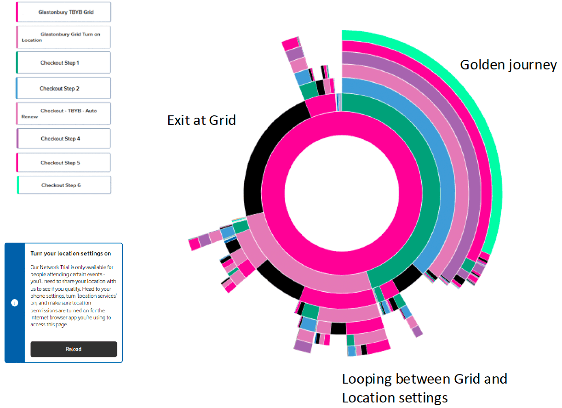
A CRO-led approach informed the entire design process: behavioural analytics, funnel analysis, and usability testing used alongside A/B testing to validate decisions and measure impact.
Performance data analysed across traffic, engagement, conversion, and behavioural patterns, with a focus on identifying optimisation opportunities within the journey.


Journey Performance
Journey entry to checkout
for Network Trial
vs
for baseline journey
Journey checkout to completed order
for Network Trial
vs
for baseline journey
Key friction point: increased drop-off at address capture during checkout
Clear opportunity to simplify or remove this step to reduce abandonment
Exposure rates
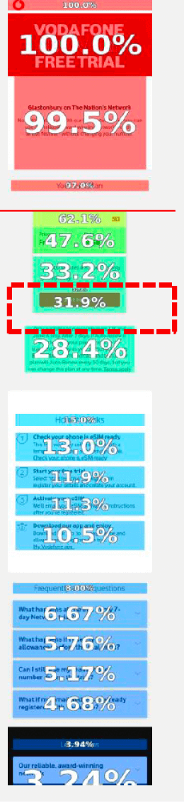
Attractiveness rates

Page Exposure
CTA is the most interacted zone
70% attractiveness rate
Plan card has only
32% exposure
two thirds of users never see the order CTA
FAQ section has
22% attractiveness rate
but only 6% exposure

Recommendations
Move Trial Plan Card above the fold, increase exposure and conversion
New USP within the Plan Card, use the trial for the full festival · keep existing phone number
Surface key FAQ answers earlier, integrate into onboarding and marketing content
Reduce checkout friction — simplify or remove address capture
Post-Trial Behaviour
12% of orders returned after one month
Returning users viewed an average of 3.7 pages
Subsequent orders after returns were minimal
The trial drove strong first-time engagement, clearer expectation-setting and follow-up journeys could further improve long-term conversion.

Conclusion

What was delivered
End-to-end UX across three campaign journeys (Registration, eSIM activation, and post-trial conversion) deployed across App and Web for Glastonbury and other events.
Impact
58.6% conversion rate outperforming baseline PAYG journeys by 2x.
70% CTA engagement
The design-led approach drove both customer confidence and commercial outcomes in a complex, high-pressure environment.
Earlier A/B testing alongside usability testing would have accelerated validation. A structured post-trial follow-up journey should have been designed from the start