
Vodafone
PAYG Optimisation
Role:
Lead UX Designer
Year:
2024/2025
Methods:
UX Strategy · Usability Testing · Behavioural Analytics · A/B Testing
Summary
Vodafone's PAYG plan page had low conversion and poor plan visibility across web and mobile. I led a research and A/B testing programme across two key experiments, Plan Card Optimisation and Carousel Layout redesign, to reduce friction and improve conversion at critical decision points.
Two experiments proven
Driving measurable uplift in conversion, click behaviour, and mobile engagement.
Key impact
Progression to Basket
Checkout to Order
PAYG Order CTR
PROJECT OVERVIEW
The PAYG SIMO landing page is a high-traffic acquisition point for Vodafone, where users compare mobile plans and make quick purchasing decisions. Despite strong exposure, analytics highlighted clear opportunities to improve plan card engagement and overall conversion.
The project focused on CRO: using iterative design, usability testing, and A/B testing to increase clarity, reduce friction, and drive measurable business impact.
Context
BUSINESS OBJECTIVES
Increase conversion from page visit to purchase
Improve plan card engagement, highlight features more effectively
Reduce drop-off at the critical decision-making stage
UX CHALLENGE
Existing plan cards were visually crowded and not optimised for quick comparison, especially on mobile
Users struggled to understand differences between plans, leading to decision paralysis
Balancing quick wins with larger experiments for measurable impact
MY ROLE
Defined CRO strategy and identified optimisation opportunities through analytics and usability testing
Designed and iterated plan card layouts and the carousel interaction
Conducted usability testing to validate design assumptions
Collaborated with analytics and product teams to measure impact
Worked cross-functionally with product, engineering, and marketing teams, aligning design decisions with business priorities and ensuring smooth delivery
All UI components designed within the Vodafone design system, ensuring visual consistency and scalability across web and mobile
Delivered insights and recommendations for future optimisations

Test 1
Plan Cards Optimisation
Define
PROBLEM STATEMENT
Analysis revealed drop-off at critical funnel steps (Grid → Basket and Basket → Order)
Plan cards had higher-than-normal click recurrence, users clicking the same button up to 1.49%, signalling confusion
The grid required an extra click to access the CTA, leaving users unanchored and unsure how to proceed
HYPOTHESES
Improved plan card clarity will reduce click recurrence and funnel drop-off
A more prominent CTA will help users progress more smoothly from Grid → Basket
Small, targeted visual improvements can deliver measurable conversion impact without overhauling the page
DESIGN-LED CHALLENGE
Optimise plan card design to reduce friction and guide users more effectively to the CTA, without overhauling the entire page
Clarify information hierarchy: price, allowance, and CTA prioritised for quick scanning
Reduce unnecessary clicks and make "Buy Now" more prominent and actionable
Maintain consistency with existing page layout and visual language
All changes guided by user behaviour data, design-led but evidence-based
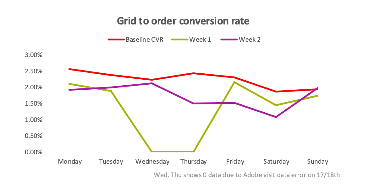
Control Design - Analytics Baseline Data
Before designing the variant, behavioural data from Contentsquare and analytics established the baseline performance and identified the key friction points.
Click recurrence
Exposure rate
Visits, Orders & Conversion rates
Design
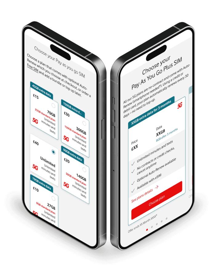
Control vs Variant
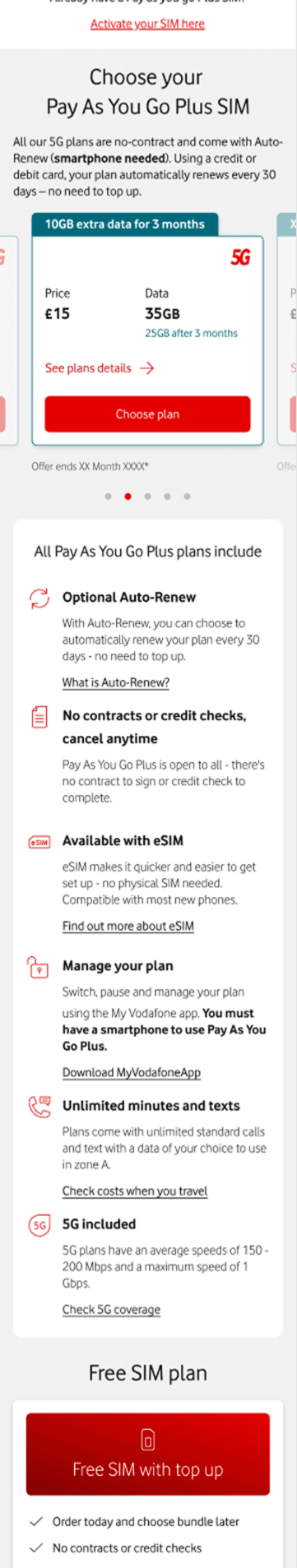
Control
Plan cards were outdated and visually inconsistent with Vodafone web guidelines
Key information (price, data, USPs) was fragmented or presented outside the card
CTA required an extra click, leaving users unanchored and sometimes confused
USP zones positioned above the plan cards

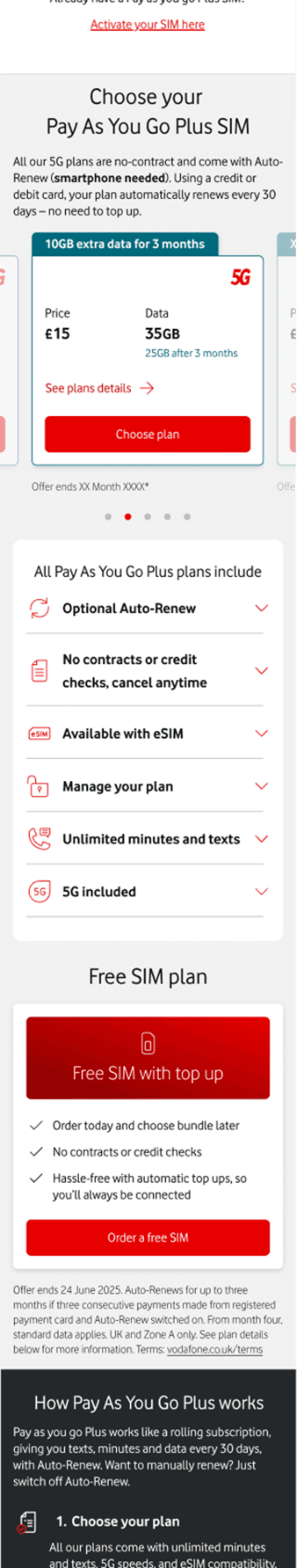
Variant
Consolidated price, data allowance, USPs, and Buy Now CTA within each plan card
Optimised plan cards with one-click selection and progression and improved layout visual hierarchy
Mobile stacked view, improved scannability on smaller screens
Addition of Free SIM plan card, clearly separated from PAYG
USP zones moved below the plan cards

Validate
A/B Test Results
The test ran for 8 weeks (March 27 – May 21) with a 50/50 split. Performance was measured across CTR, funnel progression, and behavioural analytics from Contentsquare.
Key Results
overall CTR
100% confidence
PAYG+ order CTR
100% confidence
mobile CTR
100% confidence
Click recurrence reduced
FINDING
The Buy Now CTA embedded in the new card layout anchored users, reducing repeated clicks from 1.49% to significantly lower levels.
DECISION
CTA consolidated into plan card, eliminating the extra click and reducing user confusion.

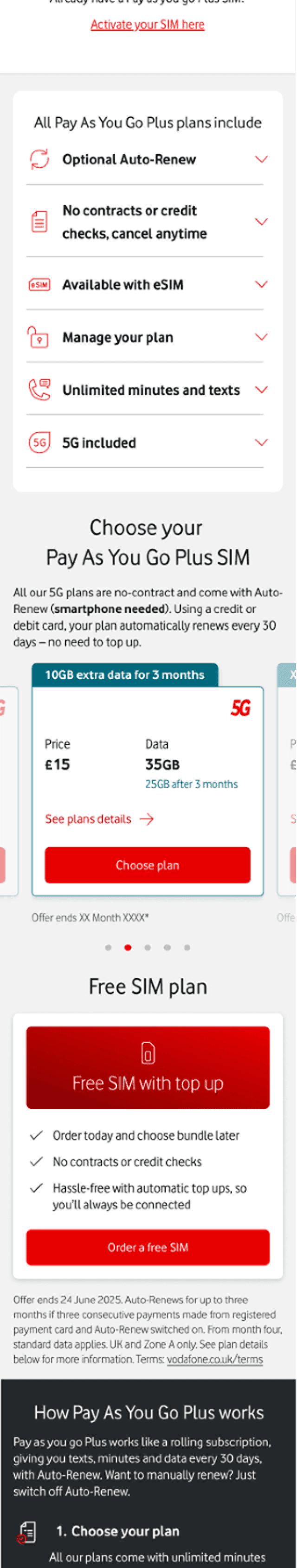
eSIM exposure
FINDING
SIM exposure dropped from 60.3% to 11.9% in the variant, users had to make an eSIM decision at basket with very little prior information, causing a -4.1% drop in basket to checkout progression.
DECISION
Recommendation is to move eSIM USP back above the plan cards in the next iteration.

eSIM float time
FINDING
Contentsquare showed eSIM had the highest average float time (21 seconds) and highest hover-to-purchase rate, confirming it's a critical trust driver in the decision journey.
DECISION
Surface eSIM information earlier and more prominently in future iterations.

Hypothesis Proven
Bringing the Buy Now CTA directly into the plan card reduced confusion and improved CTR, hypothesis proven. However, the test also revealed an unintended consequence: moving eSIM USPs below the plan cards reduced exposure and impacted basket progression. This informed the next iteration.
Test 2
Plan Cards Carousel Optimisation
Building on insights from Test 1, we explored a carousel layout to improve plan comparison and decision-making for both mobile and desktop users. Through two rounds of user research, we tested multiple variants to determine how best to present plan details and USPs while guiding users confidently toward conversion.
Define
PROBLEM STATEMENT
Despite improvements from Test 1, comparing multiple plans remained difficult, leading to confusion and hesitation
USPs and plan features were sometimes detached from the plan cards, forcing users to scroll
Funnel drop-off persisted in the Grid → Basket → Checkout progression; plan presentation was not fully supporting decision-making
HYPOTHESES
Integrating USPs inside the carousel cards will improve comprehension and reduce friction when comparing plans
A carousel layout will encourage exploration of multiple plans without overwhelming the user; particularly on mobile
Better alignment of plan details and CTA within the carousel will increase funnel progression from Grid → Basket → Checkout
DESIGN-LED CHALLENGE
Created three initial variants to explore different approaches to information hierarchy:
Simple carousel cards with USPs outside the cards below the carousel
Carousel with minimal card info, USPs presented above the carousel
Hybrid versions exploring different combinations of info hierarchy
User testing revealed that while all three improved usability in certain areas, the optimal solution emerged from integrating USPs directly inside the carousel cards; keeping the carousel simple but fully informative
This led to a fourth variant, the primary design taken forward for analytics testing
Design
Three design variants
Three initial carousel variants were explored, each testing a different approach to USP placement and information hierarchy. All variants featured simplified plan cards showing price, data allowance, and the Buy Now CTA.
Variant 1
USPs as paragraphs below carousel
Users rarely scrolled to see them.
Variant 2
USPs collapsed in accordion below
Key information hidden, creating uncertainty.
Variant 3
USPs collapsed above, carousel at bottom
Most confusing layout for users.
Usability Testing
Unmoderated usability testing across the three variants (6 sessions per variant) revealed consistent patterns that informed the direction for the final design.
Plan Comparison
FINDING
Users' attention was mostly focused on the carousel, they rarely scrolled to see USPs positioned elsewhere.
DECISION
USPs integrated directly inside carousel cards, the only position users naturally engage with.
Plan Information Clarity
FINDING
Users were uncertain about what was included in plans when USPs were outside the carousel or hidden in accordions.
DECISION
Each card now includes all key information (price, data, USPs, and CTA) visible without requiring any interaction.
Free SIM Clarity
FINDING
Free SIM was unclear to many users, causing confusion about its benefits and relationship to PAYM plans.
DECISION
Free SIM card given clearer labelling and visual separation from PAYM options.
Iteration Outcome
Based on usability findings, the solution was to integrate USPs directly inside the carousel cards:
· Each plan card now includes all key information (price, data, USPs, Buy Now CTA)
· Users can compare plans at a glance without scrolling or opening accordions
· This became the fourth variant, taken forward for analytics testing
Control vs Variant
Control
Static grid layout, plan cards displayed in a fixed grid
Price, data, and CTA visible but plan details fragmented across the page
Users often missed USPs or had to scroll to find key information

Variant
Carousel layout at the top of the page — plans scrollable in a single view
All key information consolidated within each card — price, data, USPs, and CTA
Quick plan comparison without scrolling or opening accordions
Design clean and scannable, particularly effective on mobile

Validate
A/B Test Results
The carousel variant was tested against the control across overall, mobile, and desktop performance. Free SIM was the primary growth driver across all device types.
Key Results
Progression to Basket
100% confidence
Conversion Rate
97% confidence
Mobile to Basket
100% confidence
Mobile outperformed desktop
FINDING
Mobile orders increased by +30% (191→248) versus +16% on desktop (64→74). The carousel format had the highest impact on smaller screens, where scrolling friction is most acute and plan card visibility is most constrained.
DECISION
Mobile-first carousel design validated as the primary layout approach for future iterations, with desktop optimisation as a secondary focus.

Free SIM was the key growth driver
FINDING
Free SIM orders surged +27% overall (+64 orders) and +31% on mobile. Clearer labelling, improved USP copy, and separation from PAYM options directly improved attractiveness rate from 4.87% to 5.54% on mobile. Heatmap data confirmed the shorter page layout encouraged deeper scrolling, bringing the Free SIM card into view for significantly more users.
DECISION
Free SIM visibility and clarity should be maintained and further optimised in future iterations — including exploration of placement above the fold on mobile.

Overall CVR improved across all devices
FINDING
Overall CVR improved from 2.9% to 3.7%, with mobile CVR rising from 2.8% to 3.6% and desktop from 3.7% to 4.2%. Both primary and secondary KPIs exceeded expectations with high statistical confidence (100% and 97% respectively).
DECISION
Carousel layout rolled out as the primary design, with recommendations to continue optimising PAYG SIMO conversion and to explore personalised carousel ordering based on user intent in future tests.

Hypothesis Proven
The carousel layout with integrated USPs drove measurable uplift across orders and conversion, hypothesis proven. Mobile saw the largest gains, confirming that the carousel format significantly improved scannability and decision-making on smaller screens.
5. Impact
ANALYTICS & PERFORMANCE
Both experiments proven and rolled out to 100% of Vodafone customers, delivering measurable uplift across conversion, engagement, and order volume
Plan Card Optimisation
overall CTR
100% confidence
mobile CTR
100% confidence
PAYG+ order CTR
100% confidence
Click behaviour improved
fewer repeated clicks
progression to basket
100% confidence
checkout to order
97% confidence
mobile basket progression
100% confidence
Free SIM orders
key growth driver
Final Outcome
Combined across both experiments, the optimisation programme delivered consistent uplift across CTR, funnel progression, and order volume; with projected annualised impact of 17.6K–21K incremental orders at full rollout.
Conclusion

What was delivered
Two A/B testing experiments (Plan Card Optimisation and Carousel Layout redesign) delivered across the PAYG SIMO landing page on web. Both variants were proven and rolled out to 100% of Vodafone customers.
Impact
+4.3% overall CTR and +19.8% PAYG+ order CTR, both at 100% confidence.
+25.7% to basket and +26.2% to order with +38% mobile.
Projected annualised impact of 17.6K–21K incremental orders if maintained across the full financial year
What I'd do differently
Plan Card test: moving USP zones below the plan cards caused an unintended drop in eSIM exposure (from 60% to 12%), impacting basket progression. I would have mapped eSIM's role in the decision journey earlier.
Carousel test: I would have designed a post-purchase follow-up to measure long-term retention, the order impact data suggested potential we didn't fully capture.